Graphic Design
Iconic Wines of Margaret River
Christmas Visuals
Melbourne/Australian Themed Pillar
Tequila Pillar
Perth Departures - Post Renovation Visuals
Perth Promotional Flyers
Perth Street Market
Australian Crafted Spirits
Korean Facial Masks
Website & Newsletter Banners
Voucher Redesigns
Mother's Day and Father's Day 2018
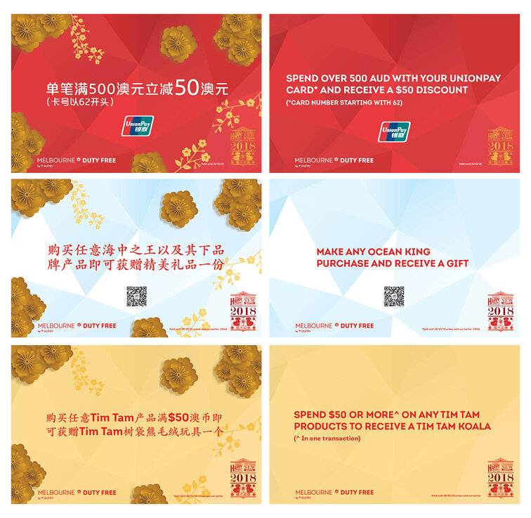
Chinese New Year and Golden Week 2018
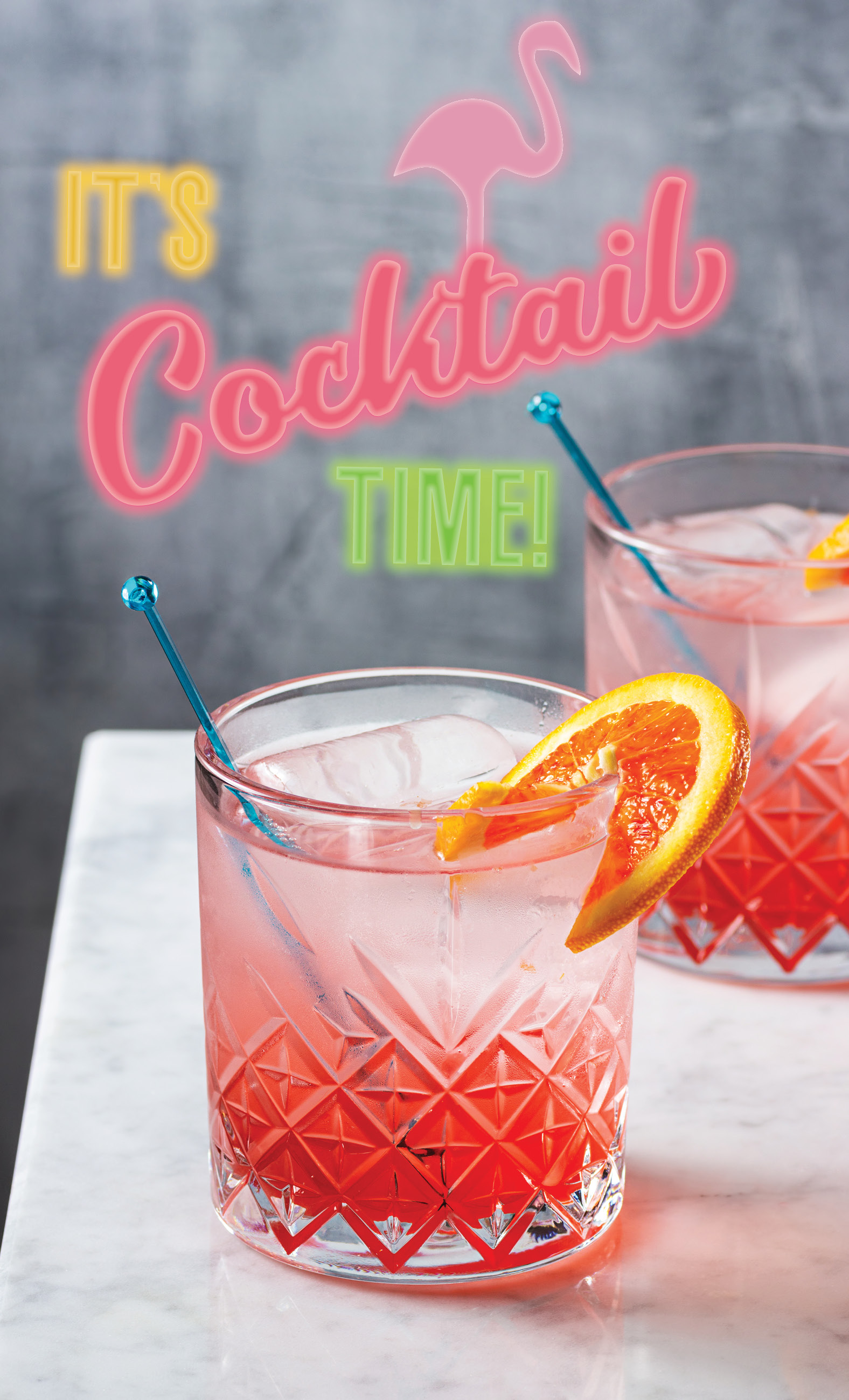
Quarterly Campaigns 2018
Uni Visual Merchandising
Retail Branding Window: G-Star Raw
Homewares Window
Free Choice Shoot: Doughnut Time
Free Choice Shoot: Teatime With Alice
Food Location Shoot: Pops Of Rustic
Fashion Location Shoot: Monochromatic Romantic
Magazine Shoot: Gourmet Traveller Cheese Shoot
Magazine Shoot: Homewares
Location Shoot
Studio Shoot
Street Art
This Is Me
Various Displays
Freelance + Other Graphic Design Work
Kingdom Event Co.
Gelau
KoTo
O'Bun - Redesign
O'Bun
Job applications
Social Media
Uni Graphic Design Work
Expressions in Ink
Directions in Use
Information Design
Digital Publication
Publication Design
2014 ISTD Typography Assessment
Annual Report
Paper Architecture Part 1
Paper Architecture Part 2
Bike Shop
Melbourne Guide
From Little Things, Big Things Grow
Mark of Life
Magazine Design
Booklet Design
Wine Labels
Death to Vector
Micro Site
Handmade Cards
Info + Contact
Graphic Design
Iconic Wines of Margaret River
Christmas Visuals
Melbourne/Australian Themed Pillar
Tequila Pillar
Perth Departures - Post Renovation Visuals
Perth Promotional Flyers
Perth Street Market
Australian Crafted Spirits
Korean Facial Masks
Website & Newsletter Banners
Voucher Redesigns
Mother's Day and Father's Day 2018
Chinese New Year and Golden Week 2018
Quarterly Campaigns 2018
Uni Visual Merchandising
Retail Branding Window: G-Star Raw
Homewares Window
Free Choice Shoot: Doughnut Time
Free Choice Shoot: Teatime With Alice
Food Location Shoot: Pops Of Rustic
Fashion Location Shoot: Monochromatic Romantic
Magazine Shoot: Gourmet Traveller Cheese Shoot
Magazine Shoot: Homewares
Location Shoot
Studio Shoot
Street Art
This Is Me
Various Displays
Freelance + Other Graphic Design Work
Kingdom Event Co.
Gelau
KoTo
O'Bun - Redesign
O'Bun
Job applications
Social Media
Uni Graphic Design Work
Expressions in Ink
Directions in Use
Information Design
Digital Publication
Publication Design
2014 ISTD Typography Assessment
Annual Report
Paper Architecture Part 1
Paper Architecture Part 2
Bike Shop
Melbourne Guide
From Little Things, Big Things Grow
Mark of Life
Magazine Design
Booklet Design
Wine Labels
Death to Vector
Micro Site
Handmade Cards
Info + Contact
Graphic Design
/
Iconic Wines of Margaret River
Graphic Design
/
Christmas Visuals
Graphic Design
/
Melbourne/Australian Themed Pillar
Graphic Design
/
Tequila Pillar
Graphic Design
/
Perth Departures - Post Renovation Visuals
Graphic Design
/
Perth Promotional Flyers
Graphic Design
/
Perth Street Market
Graphic Design
/
Australian Crafted Spirits
Graphic Design
/
Korean Facial Masks
Graphic Design
/
Website & Newsletter Banners
Graphic Design
/
Voucher Redesigns
Graphic Design
/
Mother's Day and Father's Day 2018
Graphic Design
/
Chinese New Year and Golden Week 2018
Graphic Design
/
Quarterly Campaigns 2018